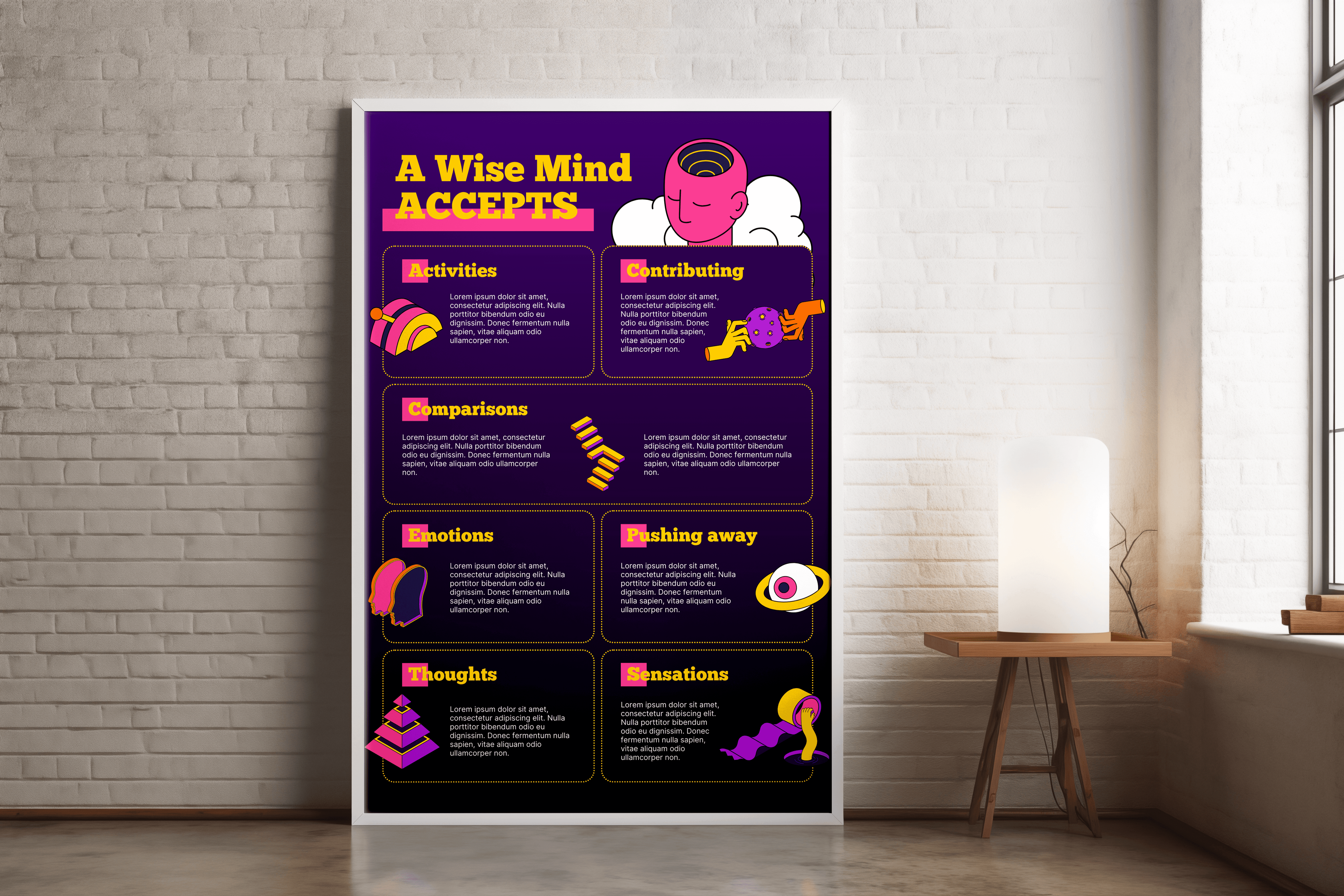
Infographics
Transforming complex datasets and dense research into visually compelling, easy-to-digest narratives for exhibitions and high-profile publications.
Year :
2022-25
Industry :
Research and development
Client :
Research Group
Project Duration :
3 weeks

Problem :
Research groups and NGOs often produce vital, data-heavy reports that contain complex findings but struggle to engage a general audience. The core problem was that these critical insights were often buried in dense text, making them inaccessible for use in public exhibitions or magazine features.

Solution :
I utilized a specialized multi-tool workflow to transform complex datasets into intuitive visual narratives:
Strategic Distillation: I collaborated with researchers to filter raw data, focusing on "hero" statistics that tell a clear, immediate story.
Data Visualization: I employed Flourish for sophisticated data modeling and interactive charts, ensuring the visualizations were both precise and modern.
Graphic Design: I used Adobe Illustrator and Photoshop to create custom iconography and layout structures that guide the reader’s eye through the "information hierarchy."
Versatile Delivery: By integrating Canva, I provided clients with scalable assets that could be adapted for different formats, from large-scale exhibition standees to social media highlights.
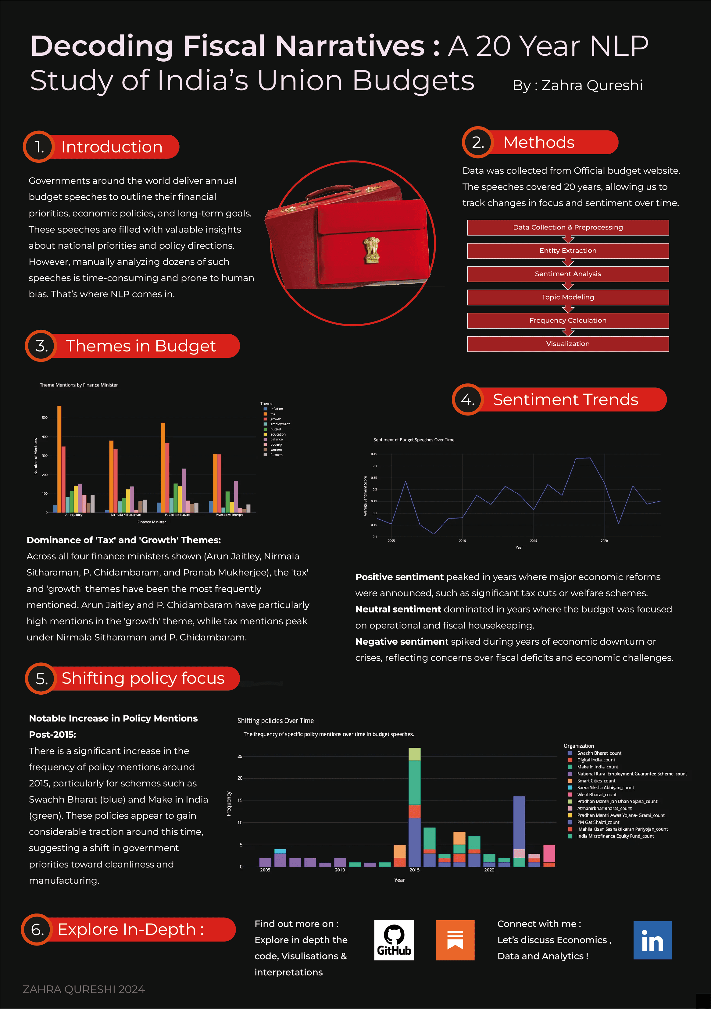

Challenge :
The primary challenge was the "distillation" process: taking vast amounts of raw data and identifying the most impactful highlights without losing scientific or journalistic integrity. I had to balance technical accuracy with a high level of visual appeal to ensure the information could hold a viewer's attention in high-traffic environments like galleries or within the fast-paced layout of a magazine.
Summary :
By bridging the gap between complex research and accessible design, I enabled NGOs to communicate their impact effectively. The result was a collection of infographics that turned "data overload" into a compelling visual experience, successfully featured in both professional publications and public exhibitions.
More Projects


Infographics
Transforming complex datasets and dense research into visually compelling, easy-to-digest narratives for exhibitions and high-profile publications.
Year :
2022-25
Industry :
Research and development
Client :
Research Group
Project Duration :
3 weeks
Problem :
Research groups and NGOs often produce vital, data-heavy reports that contain complex findings but struggle to engage a general audience. The core problem was that these critical insights were often buried in dense text, making them inaccessible for use in public exhibitions or magazine features.
Solution :
I utilized a specialized multi-tool workflow to transform complex datasets into intuitive visual narratives:
Strategic Distillation: I collaborated with researchers to filter raw data, focusing on "hero" statistics that tell a clear, immediate story.
Data Visualization: I employed Flourish for sophisticated data modeling and interactive charts, ensuring the visualizations were both precise and modern.
Graphic Design: I used Adobe Illustrator and Photoshop to create custom iconography and layout structures that guide the reader’s eye through the "information hierarchy."
Versatile Delivery: By integrating Canva, I provided clients with scalable assets that could be adapted for different formats, from large-scale exhibition standees to social media highlights.
Challenge :
The primary challenge was the "distillation" process: taking vast amounts of raw data and identifying the most impactful highlights without losing scientific or journalistic integrity. I had to balance technical accuracy with a high level of visual appeal to ensure the information could hold a viewer's attention in high-traffic environments like galleries or within the fast-paced layout of a magazine.
Summary :
By bridging the gap between complex research and accessible design, I enabled NGOs to communicate their impact effectively. The result was a collection of infographics that turned "data overload" into a compelling visual experience, successfully featured in both professional publications and public exhibitions.
More Projects
Infographics
Transforming complex datasets and dense research into visually compelling, easy-to-digest narratives for exhibitions and high-profile publications.
Year :
2022-25
Industry :
Research and development
Client :
Research Group
Project Duration :
3 weeks
Problem :
Research groups and NGOs often produce vital, data-heavy reports that contain complex findings but struggle to engage a general audience. The core problem was that these critical insights were often buried in dense text, making them inaccessible for use in public exhibitions or magazine features.
Solution :
I utilized a specialized multi-tool workflow to transform complex datasets into intuitive visual narratives:
Strategic Distillation: I collaborated with researchers to filter raw data, focusing on "hero" statistics that tell a clear, immediate story.
Data Visualization: I employed Flourish for sophisticated data modeling and interactive charts, ensuring the visualizations were both precise and modern.
Graphic Design: I used Adobe Illustrator and Photoshop to create custom iconography and layout structures that guide the reader’s eye through the "information hierarchy."
Versatile Delivery: By integrating Canva, I provided clients with scalable assets that could be adapted for different formats, from large-scale exhibition standees to social media highlights.
Challenge :
The primary challenge was the "distillation" process: taking vast amounts of raw data and identifying the most impactful highlights without losing scientific or journalistic integrity. I had to balance technical accuracy with a high level of visual appeal to ensure the information could hold a viewer's attention in high-traffic environments like galleries or within the fast-paced layout of a magazine.
Summary :
By bridging the gap between complex research and accessible design, I enabled NGOs to communicate their impact effectively. The result was a collection of infographics that turned "data overload" into a compelling visual experience, successfully featured in both professional publications and public exhibitions.